


Storage Monetization
Storage Monetization - Improved Titan Email's storage feature, resulting in a 30% increase in user engagement
Redesign the storage feature for seamless experience
Live Project
Web & mobile
Introduction
Titan email being the first business email suite, offering small businesses a delightful email experience to enhance productivity, is now available to users through partnerships with leading web presence providers, including WordPress.com and Hotjar. Founded in 2018.
Since this task was part of a design sprint and I was the only designer, I had to carefully plan and carry out each ensuring I came up with a solution that solved our user's problems. I followed the below design sprint framework. Due to the timeline.
1
2
3
4
Empathise
Define
Design
handover
to Dev
Understanding the given task considering the (WWH) framework
Define the problem space, what is the goal, and what we need to slove
Once, clear with the goal, requirements and constraints will start with sketching out ideas, designing the ui
after designing will test the design and handover the final design to dev
Design Sprint Framework
Understanding the task
Exploring the What, Why & How framework was crucial for grasping the necessity of addressing the problem and devising a solution.
What is the problem?
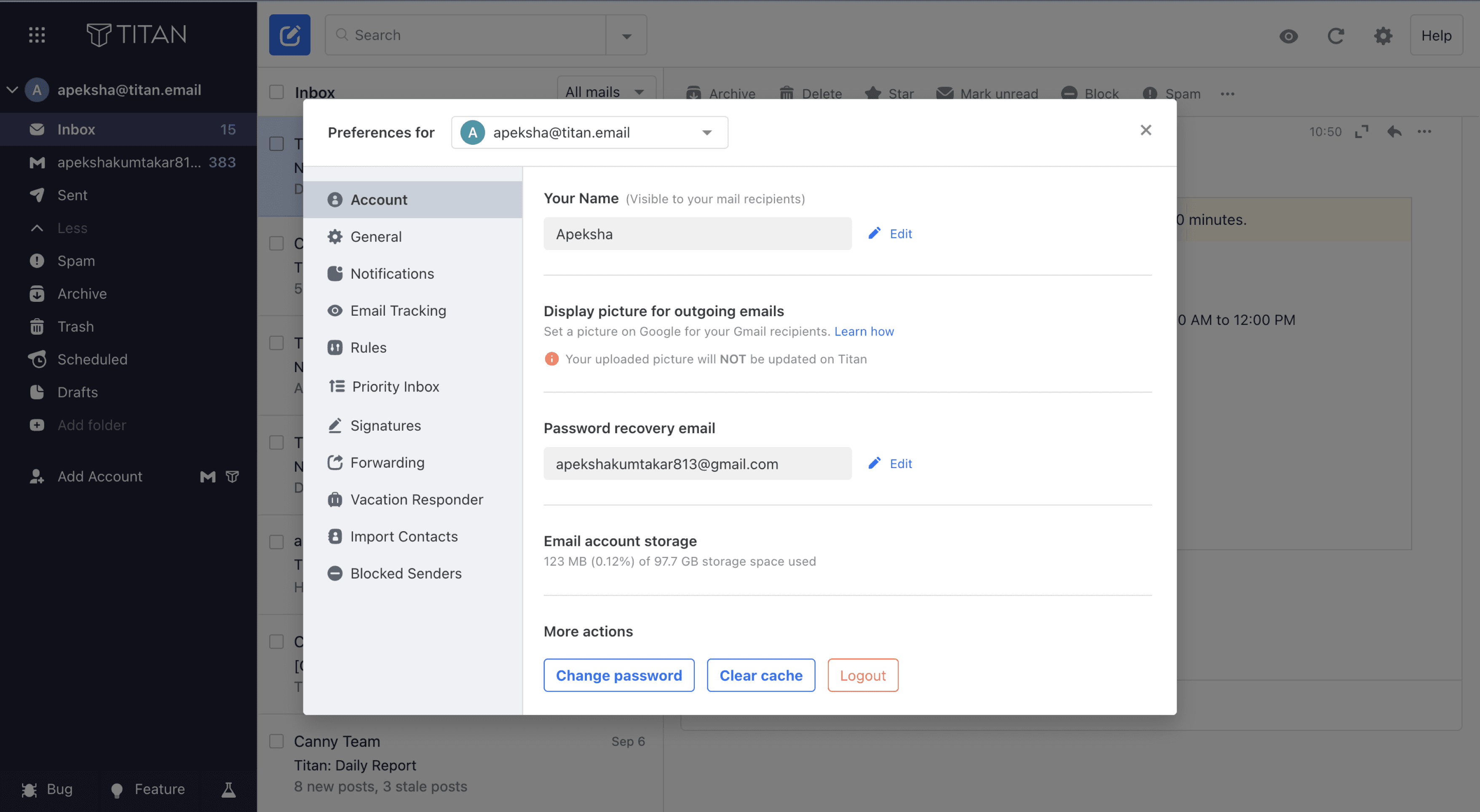
People raised concerns about not being able to see how much storage they were using and not having enough information about the current status of their storage.
Why is the problem important?
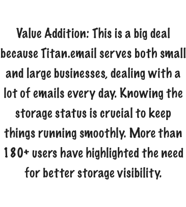
It was important to address the problem as our users deal with a lot of emails every day and can have multiple accounts. Keeping track & Knowing the storage status is essential for providing good service.
How are we going about solving it?
To tackle the problem, I read through user comments, trying to understand what they're saying and pinpointing the specific issues they're facing.
The current expereince
The Problem
I took a close look at the current user experience to understand how things currently working, here are some points I considered based on my observations.
Users may find it challenging to locate essential features due to a complex navigation structure.
Navigation Efficiency

The pathway for upgrading plans could be simplified to provide a more user-friendly experience.
Upgrade Process

Enhancing visual elements and incorporating more intuitive design can contribute to a more user-friendly interface.
Visual Presentation

Research
I began by collecting data from various sources to understand how many users are encountering issues with the current experience. So, I checked the data from NPS, support tickets, and information from Canny.
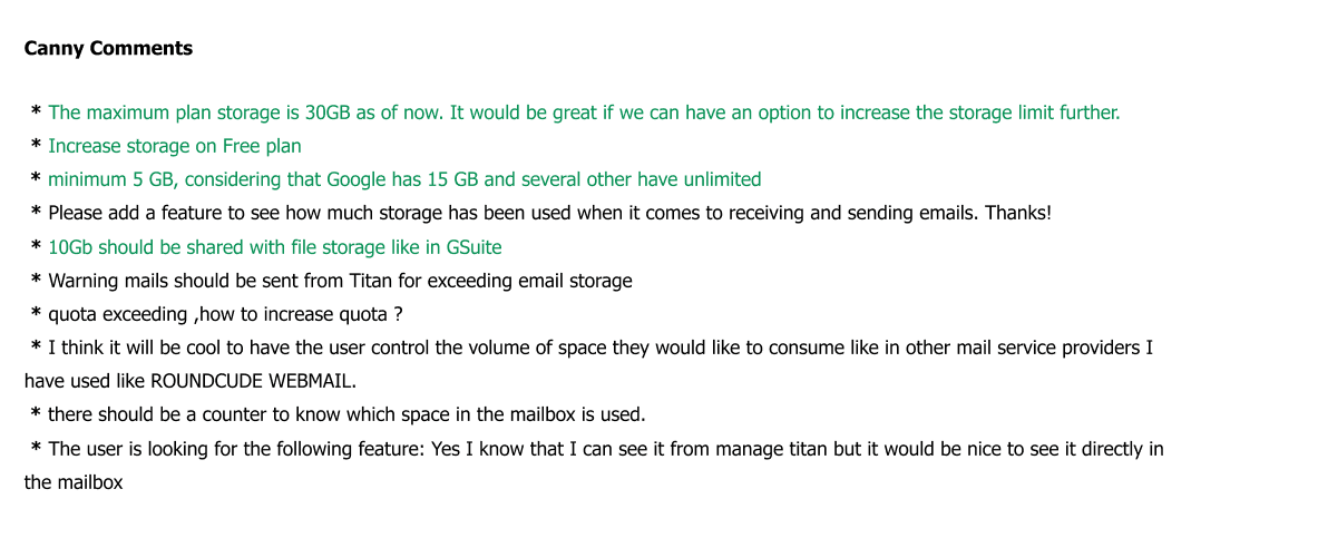
Users who have commented on the feature request

Canny.io
Canny is an external tool we use at Titan to understand what users are saying about our features, the problems they are encountering, and what we need to take into consideration.
Competitive analysis - What exist at the moment
Analysed the competitor to understand how they are addressing the problem.
Some of our primary competitors that I examined

Gmail

Proton

FastMail

Outlook

Zoho Mail
Upon analysing competitor websites, I noticed that many of them prioritise displaying the "storage feature" prominently on the web client for users. This is done to provide a clear overview of storage usage. Additionally, I observed that they utilise visual patterns to illustrate the the storage being used.
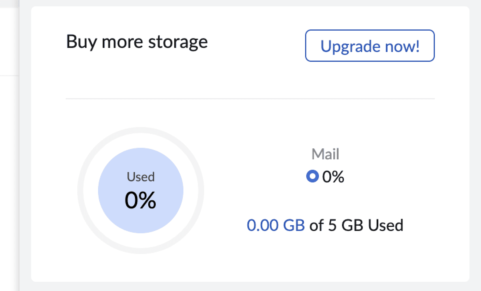
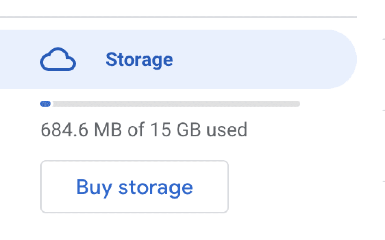
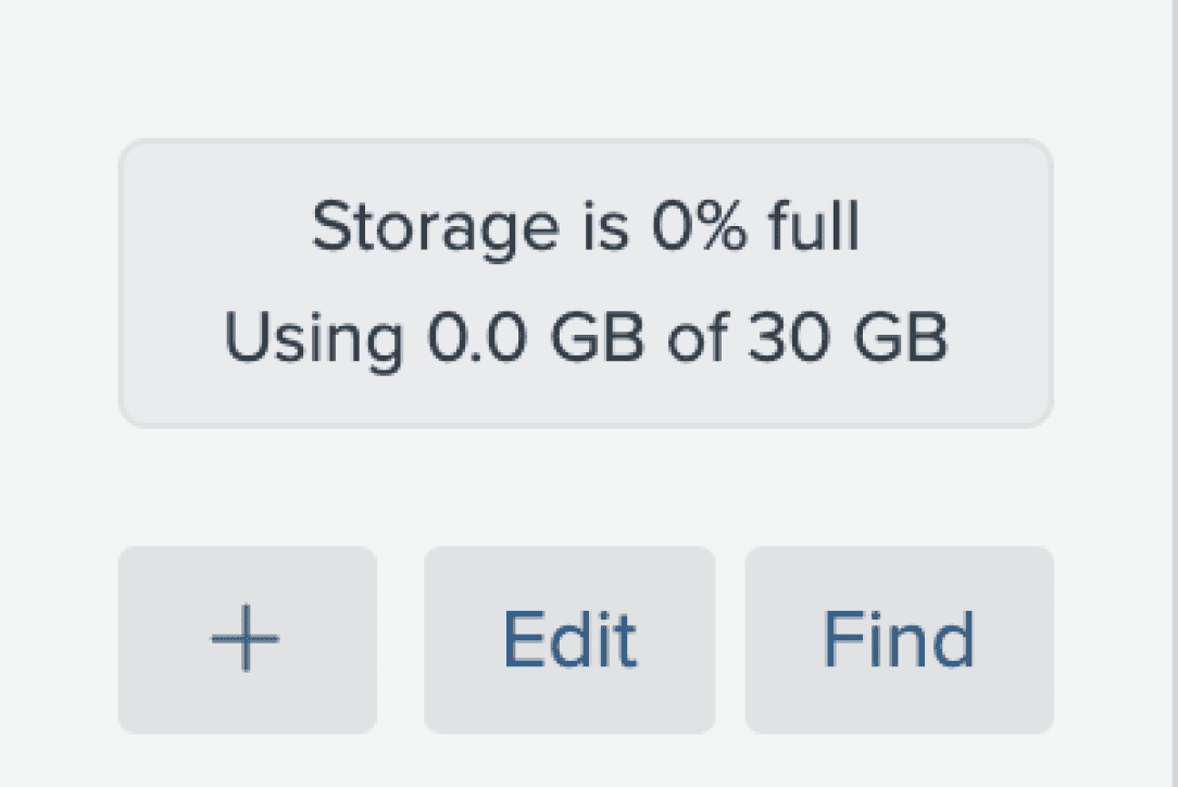
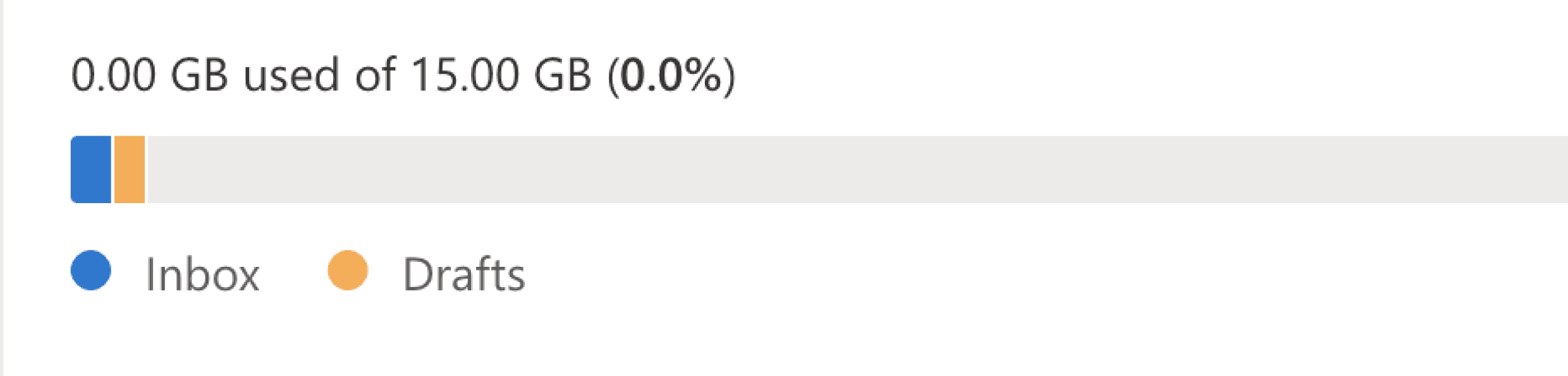

Competitor
Taking into account all the insights gained from observing current user experiences analysing competitors, and examining the data, I outlined the objectives for the scope:
Enhance user experience by prominently displaying storage visibility, ensuring users can easily understand their storage usage.
Provide valuable, timely updates on the amount of storage used, keeping users informed and in control.
Add value to user interactions by proactively nudging them to consider updates for additional storage when necessary, ensuring their needs are met efficiently.
Explored various ways to showcase the visibility issue, brainstormed ideas.
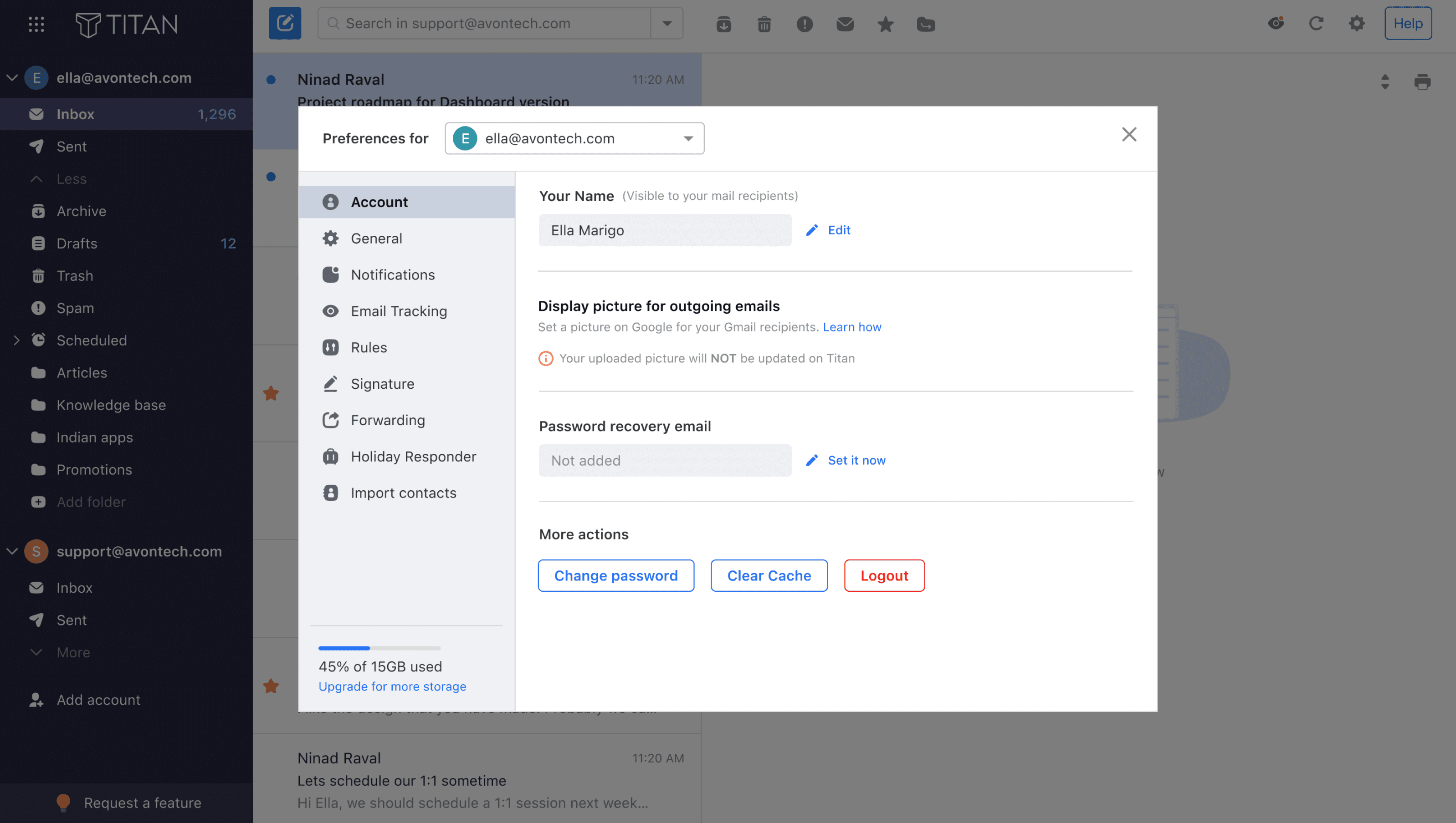
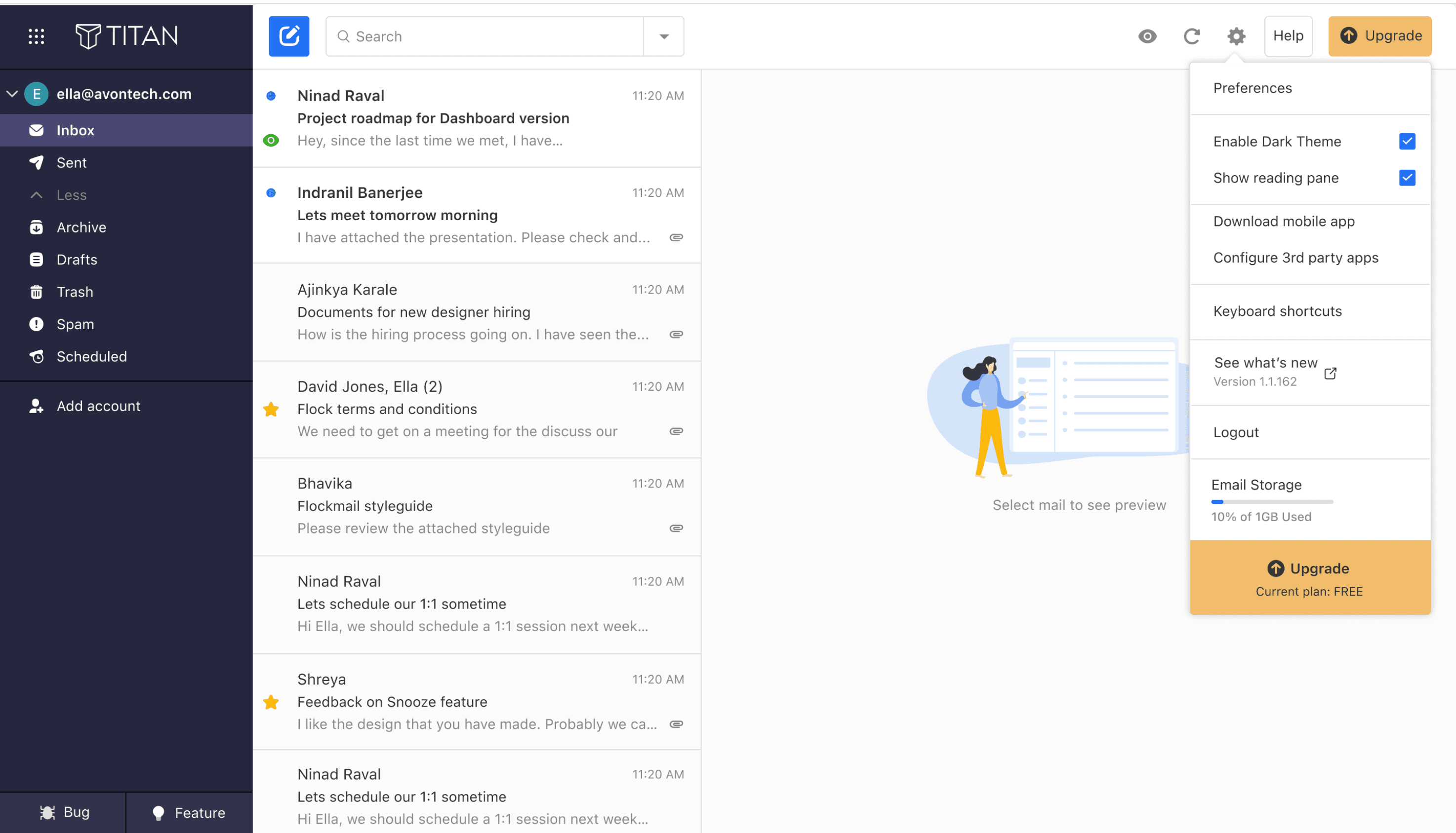
Adding Storage visibility as a part of the setting tab,
Adding Storage visibility Inside
a preference tab.
The design was not considered as user can have multiple account, and placing this inside the storage, can confuse user regarding which storage is specified.
Brainstorming sessions
1 Option
2 Option
The design was not considered as it did not solve the real problem which is visibility.
It consists of multiple tap.
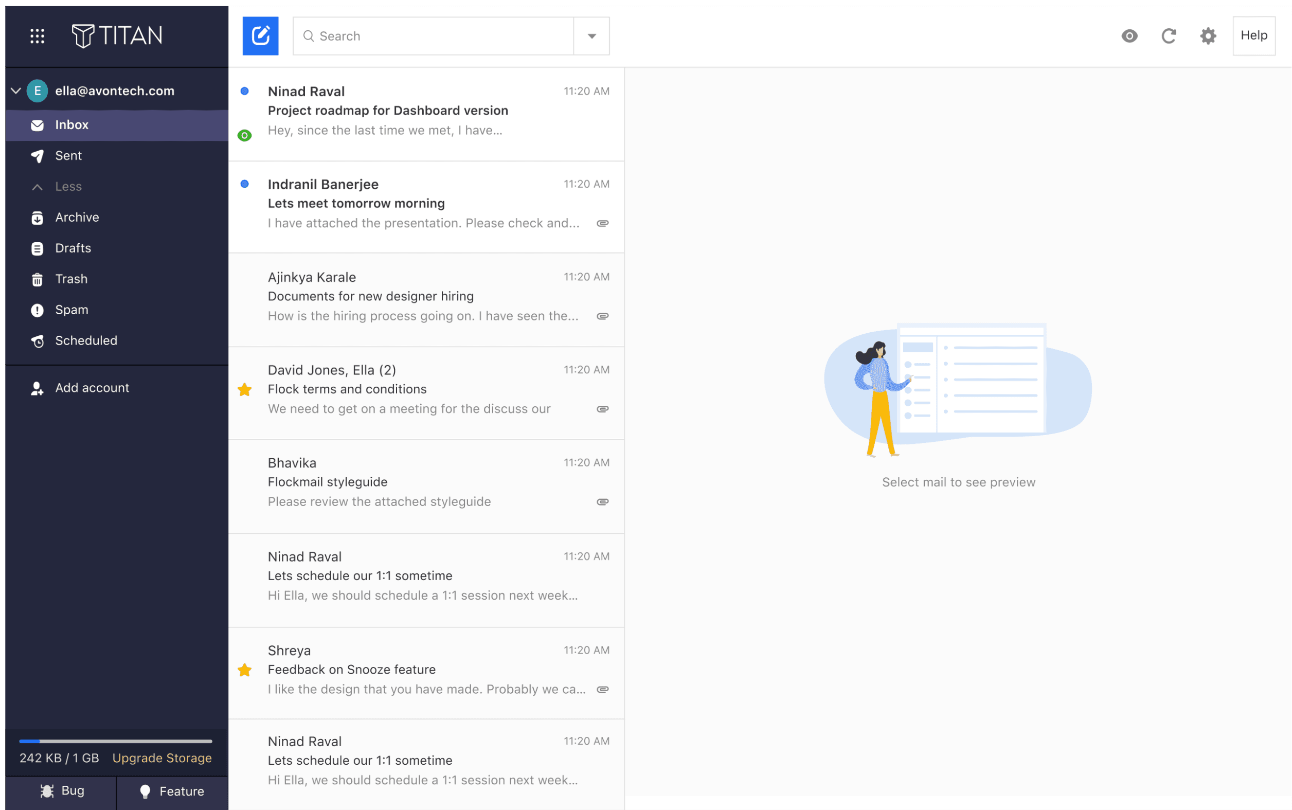
After exploring different options for displaying storage visibility, we concluded that placing it on the homepage would ensure better visibility. Since the home screen is where users interact the most, it makes sense to incorporate it there.
Considerations for this decision:
Users may have multiple accounts on Titan, so we needed to show the storage usage for each account.
Currently, we offer three plans, each with its dedicated storage allocation.
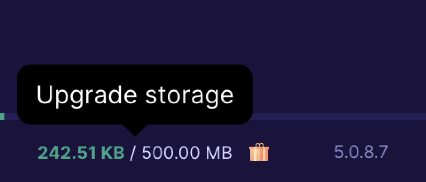
Since storage is part of the monetization feature, I have included a clear Call-to-Action (CTA) labelled as "Upgrade Storage." which would make it easier for users to upgrade their plans instead of taking a longer route.
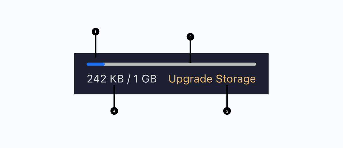
A progress bar consists of the following elements:
1 - Bar: illustrates the extent of progress for determinate processes.
2 - Track: The space filled by the bar.
3 - CTA (Call-to-Action): Prompts users to take action for updating their plan.
4 - Value: In a determinate progress bar, a fraction is shown to indicate the progress.
Incorporating a progress bar addresses the visibility issue with storage, providing users with a clear status of their storage usage and encouraging them to take action as needed.
A colour-coded indicator will assist users in easily visualising the content. For storage usage, we designated the range from 0 to 50% as blue, from 50% to 99% as orange, and when reaching the upper limit at 99-100%, it turns red.
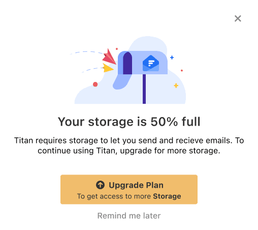
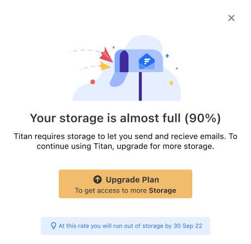
I noticed from user comments that they weren't receiving any reminders about storage limits. Understanding the importance of keeping users informed, I created popup reminders that appear at intervals. These reminders emphasise the need for users to take action when needed.
The popups act as friendly prompts, helping users stay on top of their storage usage and prompting them to take necessary actions to avoid any issues.
As part of the process, when a user clicks to upgrade (cta) depending on the plan they are currently in, we will display what each plan offers.
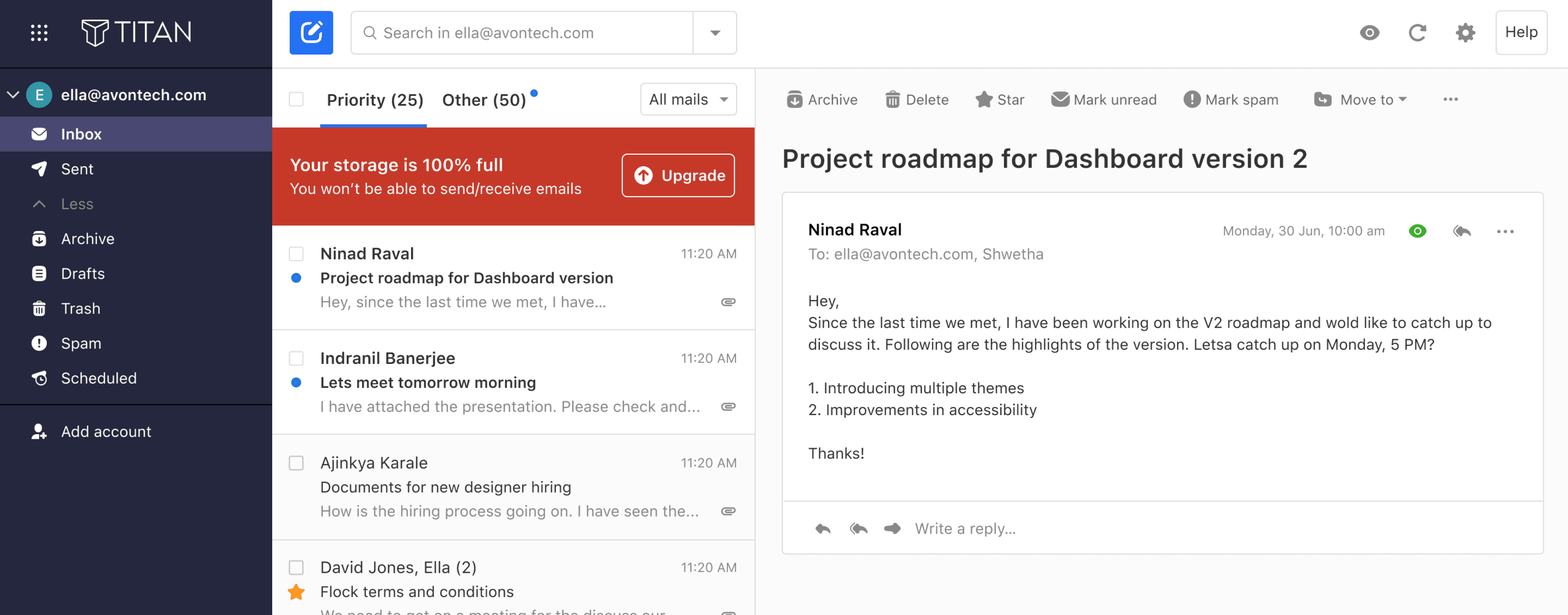
In the context of the banner, I opted not to display a similar banner when the storage reaches 100%. The current logic involves halting services when the storage is full without showing any information or sending emails to upgrade the plan. This approach, however, led to confusion, as indicated by numerous tickets on the same issue.
To address this, I wanted to emphasize the 100% banner, making it prominently visible to users. This aims to reduce the number of clicks needed to upgrade the plan and streamline the process for users experiencing full storage.
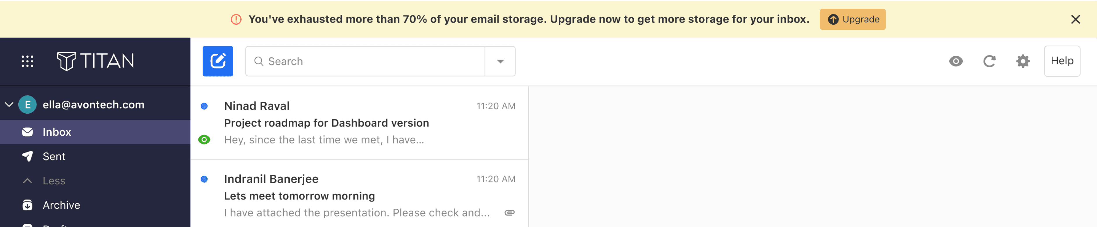
Staying consistent with the other banners displayed on Titan email, we opted to use warning banners instead of sending warning emails. The reach of warning emails was low since most users didn't even open them. Displaying a banner will attract users' attention, ensuring a higher reach. We decided to show the banner at specific intervals to avoid annoying users and giving them control to dismiss the banners if they wish.

Decided to redo the banner design because the previous one had issues with accessibility and didn't match the company's design standards. Banners, especially warning banners, serve as attention-grabbing elements that draw users' focus to important information.
Old Design



Home Page
Competitive analysis - findings
Revamping of Banner Design
Designing the Upgrade Modal
Designing the Pop Up Nudge
Final Design
The challenge and goal
The visibility of information regarding storage usage was not prominent, prompting the need to create a solution that allows users to better understand their storage usage and easily upgrade their plan accordingly.
Let's get started with digging in…
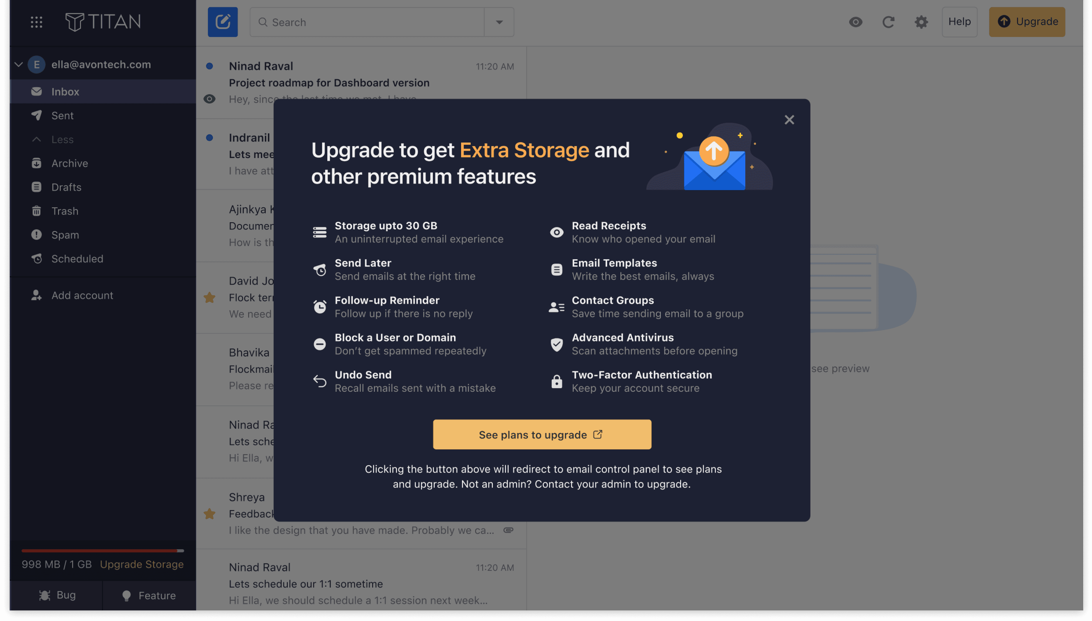
Upgrade Modal
Displaying what we offer users when they upgrade the plans,
The Impact
The UI design is now ready to be implemented in code. To ensure a smooth process with the devs, I will take the following actions:
1
Naming convention
Naming components appropriately makes coding easier and keeps the project organized and easy to navigate
2
Effective communication
Discussing and analysing complex design elements helps ensure successful translation into code.
Dev Handoff
The implementation of storage visibility resulted in a substantial improvement, with users now having a better understanding of their storage usage. Additionally, the upgrade process experienced a noteworthy 30% click-through rate (CTR), indicating a successful engagement with users seeking to enhance their storage plans.
Thank you
Thank you for Reading
New Design
Showing the service we offer upfront, help users to take action more accurately
Role
Product Design Intern - solo designer for the project. - Guidance under my manager.
Timeline - 1 week( Nov 2023)